rockstaryuzu Posted September 24, 2018 Posted September 24, 2018 7 hours ago, OonsieHui said: Yes. Now he just looks like a furball my cat coughed up. This comment made me spray a tea rainbow...
Sammie Posted September 24, 2018 Posted September 24, 2018 Do anyone have a pic of the crow in the iPad?
OonsieHui Posted September 24, 2018 Posted September 24, 2018 23 minutes ago, Terrapin said: Ideally, I would have liked less ruffles but the absence of this deep V neck looks so much more elegant on him! Haha we can be in the minority of "people who prefers Otonal without the deep v neck" together! High five! Ah well. At least we have Origin....
Terrapin Posted September 24, 2018 Posted September 24, 2018 9 minutes ago, OonsieHui said: Haha we can be in the minority of "people who prefers Otonal without the deep v neck" together! High five! Ah well. At least we have Origin.... Origin is drop dead gorgeous, Otonal is either a vest he stole from Shoma or a vest that shrunk in size after being washed ^^ Plus it looks like he forgot to wear a shirt underneath
LadySnowblood Posted September 24, 2018 Posted September 24, 2018 26 minutes ago, Sammie said: Do anyone have a pic of the crow in the iPad?
Sammie Posted September 24, 2018 Posted September 24, 2018 5 minutes ago, LadySnowblood said: Thank you.
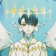
LadySnowblood Posted September 24, 2018 Posted September 24, 2018 On 9/22/2018 at 6:36 PM, rockstaryuzu said: No, but clearly there should be! Corrected, there is a story of a god who took the form of a three-legged crow, who maybe becomes a man in this telling... Feeling very "duuhhhh" for not making the connection earlier but incendiary beauty will do to a person that I guess (along with a dash of Western cultural bias) His head movement in the beginning is very crow-like and the burning, smoldering look of the costume truly is of the sun, just in a darker way (like sunspots). ETA: If he is a crow turned into man, would the open/bare areas of the costume be from shedding or molting? I thought of those as being burned patches but a creature of the sun wouldn't be harmed by it.
wpisces Posted September 24, 2018 Posted September 24, 2018 I felt conflicted about his costumes. His FS costume itself is gorgeous but it looked tacky when being seen from afar because I can't see intricate details. It was because the details and patterns on it have the same color tone with main color of the costume, which made them overwhelmed and diffficult to be seen. Same with SP costume. I only can appriciate their beauty when I zoom in photos of these costumes.
fyere0 Posted September 24, 2018 Posted September 24, 2018 50 minutes ago, ralucutzagy said: Ice King Dark Lord Spring Fairy They look so good taken together as a set... *happy sigh*
Lunna Posted September 24, 2018 Posted September 24, 2018 17 часов назад, TallyT сказал: And - say it though I shouldn't, and though I do love Shoma - because Yuzu has the longer, more slender body, more beautiful lines and curved movement, and that face and hairline, he isn't the one who would suffer in comparison.... Well, that's the obvious truth, not to blame Shoma though, I think LOCO complimented him the most. And if we deeg deeper I see POTO motives in Origin and NS in the Otonal front. The only thing Yuzu didn't try are this Shoma-like collars (and I don't complain here))). It's also interesting how Yuzu have his necklaces on display in Otonal and hides in Origin (at first I was shocked if he didn't had them) And as much as I like Chopin and Seimei I'm really greatful he has tight sleeves in both cuz he has such beautiful arm movements.
moonkat Posted September 24, 2018 Posted September 24, 2018 2 hours ago, wpisces said: I felt conflicted about his costumes. His FS costume itself is gorgeous but it looked tacky when being seen from afar because I can't see intricate details. It was because the details and patterns on it have the same color tone with main color of the costume, which made them overwhelmed and diffficult to be seen. Same with SP costume. I only can appriciate their beauty when I zoom in photos of these costumes. Yuzu may be great at seeing the big picture when it comes to his performance, but not his costume . Etude was an absolute master piece of contrast, will H&L looks muted and ordinary in comparison on camera. Chopin 1.0 had best proportions with a contrast of colors that perfectly contour. 2.0 had those golden strips that stick out sideways. Each version of Chopin look flatter the last.
Terrapin Posted September 24, 2018 Posted September 24, 2018 45 minutes ago, moonkat said: Yuzu may be great at seeing the big picture when it comes to his performance, but not his costume . Etude was an absolute master piece of contrast, will H&L looks muted and ordinary in comparison on camera. Chopin 1.0 had best proportions with a contrast of colors that perfectly contour. 2.0 had those golden strips that stick out sideways. Each version of Chopin look flatter the last. I am so in love with that first version of Chopin. Actually the version of this programme I rewatch the most is the GPF 2014 one (because of sentimental reasons as it was just after the terrible COC crash, and because of this costume: I love everything from the deeper shade of blue to the black belt adorned with these white pearls). I didn't like the second version at all because of these golden patches that stick out too much and the paler blue which looks flatter as you say. I like the collar in the last version but I'm still mourning that first version which is simpler and more elegant.
rockstaryuzu Posted September 24, 2018 Posted September 24, 2018 4 hours ago, LadySnowblood said: Corrected, there is a story of a god who took the form of a three-legged crow, who maybe becomes a man in this telling... Feeling very "duuhhhh" for not making the connection earlier but incendiary beauty will do to a person that I guess (along with a dash of Western cultural bias) His head movement in the beginning is very crow-like and the burning, smoldering look of the costume truly is of the sun, just in a darker way (like sunspots). ETA: If he is a crow turned into man, would the open/bare areas of the costume be from shedding or molting? I thought of those as being burned patches but a creature of the sun wouldn't be harmed by it. Not so much cultural bias, but maybe a lack of familiarity? I know almost nothing about Japanese mythology, so a three-legged crow god would be totally new to me.
wpisces Posted September 24, 2018 Posted September 24, 2018 3 hours ago, moonkat said: Yuzu may be great at seeing the big picture when it comes to his performance, but not his costume . Etude was an absolute master piece of contrast, will H&L looks muted and ordinary in comparison on camera. Chopin 1.0 had best proportions with a contrast of colors that perfectly contour. 2.0 had those golden strips that stick out sideways. Each version of Chopin look flatter the last. I watched "Hope and Legacy" fancams and also saw it in person at 4CC 2017 and the costume worked well to me. I can see the contrast of colors even when I was far away. With Origin costume, unlike H&L, Chopin, etc... it wasn't the color but the details and patterns on the costume that affect how it looks. Unfortunately, these details, which were supposed to get highlighted, were overwhelmed and barely seen due to lack of contrast. That's why the costume being seen from afar looked like a black armor, very different from what it was supposed to look like.
Recommended Posts
Create an account or sign in to comment
You need to be a member in order to leave a comment
Create an account
Sign up for a new account in our community. It's easy!
Register a new accountSign in
Already have an account? Sign in here.
Sign In Now